Social Icons

Pages

Showing posts with label Photoshop. Show all posts

09 April 2013

7 Kesalahan yang Sering Dilakukan Pemula dalam Desain Grafis

7 Kesalahan yang Sering Dilakukan Pemula dalam Desain Grafis


Proses adalah suatu hal yang mutlak harus dilalui untuk mencapai sebuah tujuan. Dalam desain grafis pun demikian. Mari sejenak kita kembali ke saat-saat pertama kali belajar desain dan coba-coba menggunakan software grafis. Artikel kali ini mengangkat kecenderungan-kecenderungan yang biasa dilakukan oleh pemula ketika baru mengenal dunia desain grafis. Kesalahan-kesalahan mendasar yang mungkin semua desainer grafis pernah melakukannya.


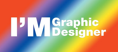
1. Rainbow Background
7 Kesalahan yang Sering Dilakukan Pemula dalam Desain Grafis

Beberapa software grafis seperti Adobe Illustrator dan Photoshop menyediakan palette warna colorful secara default. Kita dapat memilihnya dengan mudah tanpa harus mengerti teknik mengkombinasikan warna. Hal ini mungkin salah satu penyebab mengapa pemula dalam desain grafis sering kali menggunakannya sebagai background. Kombinasi warna seperti ini memang membuat desain menjadi colorful, tapi hati-hati!, Fokus desain kamu yang berada diatasnya malah akan sulit untuk dilihat. Selain itu, kombinasi warna seperti ini seringkali membuat mata menjadi sakit.

2. Emboss dan Shadow

7 Kesalahan yang Sering Dilakukan Pemula dalam Desain Grafis

Belajar dan mempraktikkan teknik dan berbagai macam efek memang menyenangkan, saya sendiri merasakan itu pada saat baru belajar mendesain. Sayangnya, pemula terlalu berlebihan dalam menggunakannya sehingga mengesampingkan fungsi utama dari desain grafis itu sendiri, yaitu mengkomunikasikan pesan. Efek emboss dan Shadow, apabila digunakan tidak pada tempatnya akan mengganggu keterbacaan pesan dan dengan mudah membuat karya terkesan amatir.

3. Pemilihan Font yang Salah

7 Kesalahan yang Sering Dilakukan Pemula dalam Desain Grafis

Comic sans MS, papyrus, dan Jokerman adalah font yang paling sering digunakan oleh mereka yang awam dibidang desain grafis, termasuk pemula yang baru belajar desain. Font-font tersebut sangat familiar hampir dimata semua orang karena terlalu sering digunakan. Cobalah bereksperiman dengan font lain. Ada banyak alternatif font yang tersedia di situs-situs yang menyediakan font gratis, dafont.com adalah salah satu yang saya rekomendasikan. Pelajari juga ilmu tipografi agar dapat menerapkan huruf secara fungsional pada desain.

4. Menggunakan Terlalu Banyak Font

7 Kesalahan yang Sering Dilakukan Pemula dalam Desain Grafis

Sepertinya banyak orang yang merasa hebat kalau sudah menggunakan banyak font dalam sebuah desain. :D Batasi penggunaan font yang berlebihan. Desain yang baik adalah desain yang memiliki kesatuan, termasuk kesatuan dalam hal memilih huruf. Menggunakan banyak font akan menciptakan kekacauan dan merusak kesatuan sebuah desain.

5. Kombinasi Warna yang Berantakan

7 Kesalahan yang Sering Dilakukan Pemula dalam Desain Grafis

Desainer pemula biasanya kesulitan dalam mengkomposisikan warna dalam karyanya. Biasanya kombinasi warna akan terlihat 'mengganggu' atau 'tabrakan'. Solusinya adalah dengan belajar teori warna. Perbanyak juga referensi pengetahuan kamu tentang warna dengan melihat komposisi warna yang digunakan oleh desainer-desainer lain.

6. Mengedepankan Ego

7 Kesalahan yang Sering Dilakukan Pemula dalam Desain Grafis

Ekspresif adalah sifat dasar manusia, semua orang memilikinya. Tapi sebagai desainer grafis, kita dituntut untuk mengesampingkan ego. Belajar melihat dari sudut pandang lain dan melihat dengan cara yang berbeda. Desain grafis berbeda dengan seni murni yang memiliki ruang bebas untuk berekspresi dan berkreatifitas. Kreatifitas dalam desain grafis bisa diwujudkan melalui pemilihan strategi, bukan sekedar didasarkan pada keinginan hati.

7. Mengabaikan Proporsional Bentuk

7 Kesalahan yang Sering Dilakukan Pemula dalam Desain Grafis

Proporsional bentuk bisa berarti keseimbangan sebuah bentuk. Dalam konteks desain grafis, ini bisa berupa huruf, simbol maupun gambar (image). Pemula seringkali mengabaikan aturan bentuk proporsional ini. Misalnya, menarik font sesuka hati hingga merusak struktur sebenarnya yang telah dirancang oleh desainer font tersebut. Pada gambar juga demikian, seringkali kita menemukan gambar dalam sebuah media visual yang sudah ditarik tanpa memperhatikan proporsional bentuk.

Kesimpulan

Kesalahan adalah hal yang wajar dalam proses pembelajaran. Hal terbaik adalah mencari solusi bagaimana cara mengatasinya. Hampir semua desainer grafis pernah melakukan kesalahan-kesalahan diatas, saya adalah satunya :D.
Bagaimana dengan kamu? mari berbagi pendapat!


sumber : desainstudio.com
Read more

08 December 2012

Background Grafis Vektor Gratis

Dalam perkembangan digital grafis, vektor juga dapat digunakan untuk membuat grafis seperti : logo, web desain, desain kaos , undangan atau keperluan lain yang dapat anda sesuaikan dengan fungsi dan kegunaannya. Gambar vektor atau grafik vektor merupakan gambar digital yang berbasiskan persamaan matematis. Gambar Vektor terdiri dari penggabungan koordinat-koordinat titik menjadi garis atau kurva untuk kemudian menjadi sebuah objek, sehingga gambar tidak menjadi pecah walaupun diperbesar atau diperkecil. Gambar vektor umumnya memiliki ukuran yang lebih kecil bila dibandingkan dengan gambar bitmap. Beberapa format gambar vektor di antaranya: .CDR , .PAT , .CDT , .DES , .CSL , .CMX , .AI , .WPG , .WMF , .CLK , .SVG , .EPS dll. [/wikipedia.org]
Berikut ini beberapa background grafis vektor :
1. Vektor dynamic lines
vektor green *all-free-download.com
Download ( all-free-download.com)
2. Vector Background Green
vektor green *all-free-download.com
Download ( all-free-download.com)
3. Vektor colorful Waves
vektor waves *all-free-download.com
Download ( all-free-download.com)
4. Vektor Waves dan Lines
vektor waves *all-free-download.com
Download ( all-free-download.com)
5. Abstract Colorful Waves
Abstract Colorful Waves *all-free-download.com
Download ( all-free-download.com)
6. Abstract Colorful Swirl Waves
Abstract Colorful Swirl Waves *all-free-download.com
Download ( all-free-download.com)
7. Abstract Waves and Circles
Abstract Waves and Circles *all-free-download.com
Download ( all-free-download.com)
8. Vektor Abstract Colorful Rainbow
Vektor Abstract Colorful Rainbow *all-free-download.com
Download ( all-free-download.com)
9. Vektor Colorful Abstract Background
Vektor Colorful Abstract Background *all-free-download.com
Download ( all-free-download.com)
10. Vektor background abstract colorful
Vektor Colorful Abstract Background *all-free-download.com
Download ( all-free-download.com)


Read more

08 October 2012

Remove a Person From a Photo With Photoshop CS5’s Content Aware Feature

Final Product What You'll Be Creating


With the launch of the new Adobe Suite of programs comes the long awaited Adobe Photoshop CS5. Packed with new features to speed up your workflow it truly is the most advanced edition of Photoshop to date. One of the new features we will be looking at today is called Content Aware. This feature allows you to quickly fill in a selection with surrounding content making it look like a part of the original image. In this case we will choose to remove a person from a photo, this can be done in less than five minutes. With the additional image enhancements this tutorial will take you less than 10 minutes to complete.


Original Image

Before we begin, download the image that we will be working with. As you can see, there are two individuals in this photo. In today’s tutorial, we will use Photoshop CS5′s Content Aware Feature to remove the man on the left.

Step 1

Using the content aware tool on different images produces different results. An image with a gradient background such as the sky in this image is quite tricky to work with. Open beach.jpg in Photoshop.

Step 2

We are extracting the person on the left from this photo. Using the Pen Tool, (P) Begin by making a path around the subject. The nice thing about using content aware is that you do not have to be exact when making a selection. In fact, do your best not to cut too close to the subject.
Notice in the image below how far I am drawing the path from the subject. Try to keep this distance all the way around. If you go too close, Content Aware will take pixels from the subject. If you cut too far it will take pixels from the woman on the right.

Step 3

Once you complete the path around the subject, turn it into a selection. This can be done by right clicking on the path and selecting Make Selection.
A dialog box will pop-up, make sure the feathering is set to 0px. Leave all other options as they are. Click OK.

Step 4

Now we have an active selection around our subject. In this step we will make the subject disappear from the image using Content Aware Fill. To do this, go to Edit > Fill.
A dialog box will pop-up, make sure the Content Aware option is selected. Blending mode is set to normal and the opacity is at 100%. Hit OK.
You can cancel the selection at any time by making another selection or just clicking anywhere else on the page with any selection tool.

Step 5

In this step we will remove some of the other artifacts in the image using the same process. The content aware tool did miss a spot where the subject’s foot originally was. To do this, draw a rectangle around the area using the rectangle selection tool. And use the content aware fill as we have done in the previous steps.
Now let’s remove the people towards the right of the image. Create a rectangle selection around them and use the steps we just demonstrated to remove them.

Step 6 (Optional)

Using the Crop Tool (C) lets crop the image so that the focus is drawn to the woman jumping. To do this, just crop out an area of the image that you would like to keep. Beware of the shadow that is left behind from the person that we have removed. You can use the Content Aware feature to remove this shadow but I have decided to crop it out altogether.
Click the checkmark at the top to keep this area. Photoshop will discard the content that is outside of your crop area.

Step 7 (Optional)

In this step we will enhance the photo by giving it a more vibrant look. The colors currently appear somewhat dull. There are many ways to accomplish this but we will use Color Curves. To do this, go to Image > Adjustments > Curves, (Cmd + M). A dialog box will pop-up and we will select each of the channels, R, G, B and work on them separately. Select the Red channel from the dropdown menu.
We are going to make two points on the graph. One in the bottom of the top right square, and one in the top of the bottom left square.
Once you have made these points, make sure you enter the values for each. For the top right point the Output value is 199, and the input value is 185. For the bottom point the values are 56 and 68, respectively. You can play around with these setting and adjust them to whatever you feel is appropriate. Repeat this for each of the colors, Green and Blue.

Final Image

Your image should now look something like the one seen below. As you can see, we have removed the man on her left with very little effort using Photoshop CS5′s new Content Aware Feature.
Read more

13 September 2011

Merubah Photo Menjadi Kartun

1. Pilih foto sesuai selera


2. Pilih Filter > Artistic > Poster Edges


lalu atur seperti ini
Edge Thickness = 10
Edge Inthensity = 4
Posterization = 0


3. Jangan dulu click OK!!!!

pilih New Effect Layer


pilih Film Grain


atur seperti ini
Grain = 0
Highlight Area = 11
Intensity = 10


4. Pilih New Effect Layer lagi
setelah itu pilih cutout


Atur seperti ini
Number of Level = 8
Edge Simplicity = 4
Edge Fidelity = 3


5. Baru klik OK. Hasil sementara


6. Bagian Terakhir, bagian yang butuh kesabaran

Disini kita akan merapikan bercak-bercaknya menggunakan Brush Tool
dan untuk mengambil contoh warnanya menggunakan EyeDropper Tool tinggal warnai sesuai warna yang ada di photo,
contoh : misalnya kaca mata warna hitam, warnai kaca mata dengan warna hitam, begitu juga dengan bagian yang lainnya.

HASIL AKHIR


Sumber : Kaskus
Read more